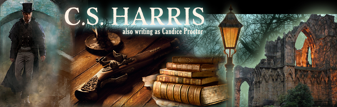
It’s cover conferencing time for Where Shadows Dance. This is always a nerve wracking experience for an author, when somewhere in the deep dark recesses of a publishing house, editors and people from sales and marketing sit around a conference table with the art department—but without us—and brainstorm what our next book is going to look like. When they get it right, as they did with Why Mermaids Sing, the results can be stunning and exciting. When they get it wrong…Well, look no further than disasters like When Gods Die and What Remains of Heaven.
They always politely ask me for suggestions, even though they never really take them—or if they do take them, they distort them to the point they make me wish I’d kept my mouth shut. But ever a glutton for punishment, I spent some time on the internet looking at images and meandered around Borders last night, looking at covers.
It always amazes me how many really bad covers there are out there. If an author already has a huge, built-in readership or if a book gets enough hype—think The Girl with the Dragon Tattoo—it doesn’t matter much what the cover looks like (although you still have to wonder what they were thinking). But for most authors, the cover—like the title—is critically important. And that’s a scary thought because titles and covers are essentially out of our control.
I remember back when Ballantine bought my very first book, my editor ended our first telephone conversation by saying, “Oh, and we’re changing the title to Night in Eden.” A few days later, a cover flat arrived in the mail—a brilliant sapphire blue background with giant cottage-style flowers. This for a book about a woman who is transported to Botany Bay for accidentally killing her adulterous husband in 1810. I decided they must have had the cover and title already made up for another book that was never delivered, and someone got the bright idea of using it for my book. I have spent my entire career listening to people say, “I’ve never understood why that book is called Night in Eden.” To which I essentially respond, “Neither have I.”
Anyway, back to my meander around Borders. I saw this book that really caught my eye:

Great title, unusual cover, and both complement each other enormously. I picked it up and read the cover copy—which is exactly the reaction you want the title and cover to provoke.
Another great cover:

Urban fantasy isn’t my thing, so I didn’t read the cover copy. But I still think it’s a dynamic, eye-catching cover. Most of what else I saw was just plain forgettable.
So I'm open to suggestions. What do YOU think the covers of this series should look like? God knows NAL needs help, because they're still floundering, searching for the right image for the series.
On a side note: some more good news; What Angels Fear and When Gods Die are both going back to press, AGAIN. And this time they’re upping the print run even more. So something is definitely happening out there. Do you think maybe this will inspire them to give me a good cover? Nah…


28 comments:
I came in to your series with Mermaids... and so I think you must be correct - because we always judge a book by its cover and by the title. I like mermaids (even prior to that pesky Disney incident)- and so I picked up Why Mermaids Sing.I didn't hate the last cover - but you were right that it didn't match well and was a little "romantic" for my tastes. I like the shadowy period London streets idea - since that is much of the ambiance of the series. Honestly I can't remember the cover of Mermaids right now - but I am thinking that was one of the covers. I'll keep an eye out and post any suggestions - but I hope with all of your recent growth they would give you a little more say. As a writer myself, to hear the title and cover are not a writer's territory - is disheartening.
arielswan.blogspot.com
Actually, I think NAL don't really need to look further than your Australasian covers. Each one does a nice job of catching the eye, using elements from the book *and* evoking the mood of the series. :)
And that first one is certainly a much better cover than Mr Hart's debut, Down River.
I know covers are vitally important to most folks, and to writers certainly. But I just hardly ever do more than note them in passing. I can remember your Mermaid cover had a cool gold image on it. Other than that, nothing. I never find myself looking at a book's cover for more than a very few seconds when I first pick it up. I may in fact remember the cover images as separate from the books, like the great Frazetta covers, for example, but I couldn't even hazard much of a guess as to which picture went with which particular book. They are separate entities for me.
Covers are best when they evoke rather than illustrate. The mermaid cover evoked. The Heaven cover illustrated a scene not really found in the book at all (or maybe I misunderstood it, which is to the point).
Perhaps suggest a cover with a more abstract motif? BTW, I do happen to like the latest cover of the Girl... series by Larsson. The orangy hair, evoking flames, kind of cool, and the type has a kind of military stencil thing going on...
Ariel, that's interesting; thanks for your input. As for author input...I wouldn't mind so much if I felt that they knew what they're doing.
Steve, I went and looked at Hart's Down River; you're right. Very blah. As for the Aussie covers, I'm not sure they'd fly here. But they are very striking.
Charles, I think covers are only important for new readers who have never heard of a book or an author. I don't pay any attention when it's a book I know I want to get. Glad to see you're starting to feel better.
pax deux, I think that's a good point. I'll have to use the word "evoke." When they did Heaven, I told them I thought the cover needed to convey a sense of mystery, action, danger, and history... and they gave me Sarah Jessica Parker running in a corset.
I'm pretty sure I found the Sebastian St. Cyr series when I was on amazon looking for the next book I needed in the Lady Emily series by Tasha Alexander. I think one of the books popped up under the if you liked this book you'll like...section. I read the info and thought that they sounded interesting. I typically don't do mystery type series (at least not the modern ones) but really liked the Lady Emily series and historical fiction so I bought the whole series just from reading the descriptions online. I'm so glad I did as I love them all.
I think book covers are somewhat important. While I agree that readers of an established author will buy a book regardless of the cover, a new reader perusing the shelf may pick up a book because of the cover. I know I've picked up a book to read the back blurb because I liked the cover.
As for this series, I like covers that evoke mystery and danger, such as having someone running through the fog while looking over their shoulder or a shadow in the distance. This almost sounds like the cover for What Remains of Heaven, but the cover must be consistent with the action taking place in the book.
SJP in a corset! That's what it is!
I guess I just missed that part of the book. I will have to re-read it :D
I vote that you absolutely deserve a great cover! Sounds like you're on a roll.
I'd suggest www.fantasticfiction.co.uk if you would like to have a look at different edition covers for lots of titles. I'm always fascinated by the difference between US and UK book covers. Being a visual person, covers (and titles) tend to be the first thing that catch my attention. Take a look at the UK hardback cover of COMPANY OF LIARS by Karen Maitland. When I first saw it from a distance, I thought "Now, what is this? A book about Wayang Kulit (Shadow puppet theatre)?!" Of course it is not upon closer look, but it did make me want to know what the book was actually about (Read and enjoyed it too). Compare the US vs UK covers of fantasy authors such as Patrick Rothfuss, Scott Lynch and Joe Abercrombie (Can you guess which versions I prefer?). Compare the Arianna Franklin's, the CJ Sansom's, just to name few mystery/thriller authors.
SJP in a corset! That's what it is! I guess I just missed that part of the book. I will have to re-read it :D
I think I managed to figure out what NAL meant to represent with the cover of HEAVEN. But the details are way off that it still doesn't make sense (Oh, let me reread the book again).
My favourite cover among your Sebastian books is still the one depicting the winged mermaid though I also like the Australasian ones. I'm sorry I have no suggestions to offer for WHERE SHADOWS DANCE. Being a visual person, the title brings to mind more than one possible images/imageries ....
--Zinnuraain
agree with you entirely...
when it's a book i want, the cover is meaningless
melodyisapirate, that's good to know. I've bought nonfiction books that I've seen on Amazon like that, but not fiction. I'm so glad to hear you like the series!
Kim, I think you're right. When we're in a bookstore, SOMETHING has to draw us to a book we've never heard of, and what else can it be but the title and cover? They were going in the right direction with Heaven, but took some weird young adult/eroitca/paranormal turn.
Pax deux, you think it's bad now, but before I pitched a fit, the woman WAS wearing a white corset and a slip. I got them to take out the lacing, add sleeves, and tint it a color. They refused to add shoes.
Rick, thanks!
Zinnuraain, I went and had a look at that site. Very interesting. I know Laura Joh Rowland's new English covers are so striking that her American publisher has decided to use them. But that's unusual. It's interesting the way different countries can have such strikingly different cover traditions.
laughingwolf, that may be why the covers of huge bestselling authors are so plain. They figure everyone already knows the author, so they don't need to entice, just make the author's name very big since that's the real draw.
A new twist to an old desire...
barefoot and in the catacombs?
I wonder who they think is reading these books?
Congrats on the two books going back to press!
I have to confess, once I've found an author I don't really look at the covers...the cover isn't going to stop me from reading the book. But if it was a new-to-me author, then yes, the cover is important.
And what's VERY important is that the cover needs to reflect the content...there's nothing worse than a cover that has NOTHING to do with the book, or worse, is a complete contradiction. I still think of Pleasure for Pleasure by Eloisa James. The heroine in the book (it's a historical romance) is described (in the previous three books) as very, very curvy. Yet the cover portrays a very, very slim woman (as per today's 'fashion' standards). Good luck Candy, I'm keeping my fingers crossed for you!
Oh, and I love the cover for Three Days to Dead too.
indeedy :)
Thanks, Orannia! And I agree about the cover needing to reflect the content of the book. The art department of my thriller publisher just asked me what my heroine looks like--for the cover of the THIRD book.
The art department of my thriller publisher just asked me what my heroine looks like--for the cover of the THIRD book.
Oh dear. Trying to find the silver lining, at least they asked rather than just making it up...
Candy, I'd say that the publisher should look no further than reading and *re-reading* the prologue for inspiration. The body transporting, the skullduggery, the mist, and the menace in the atmosphere. That'll set the stage for the prologue, which is turn sets the stage for the rest of the story.
A good cover is always to be admired. I freely admit I have bought books on covers alone. I do not like being gypped, where the cover promises one thing and book is something else entirely. Of course, with an auto-buy author, I'd buy even if it came in manuscript form bound in brown paper. That said a well-made book, with good book design is a thing of joy and beauty.
Where Serpents Sleep is my favorite cover - misty, evocative, burnished. I'm crossing my fingers that NAL does the right thing by you this time.
Congratulations on going back to print and hardback! Here's hoping your good luck sticks around and you get a great cover, too. :)
I just sent off a cover art sheet for my first novel.
The other covers by the publishers are very good, but now I'm worried...
I am a knew fan of your St.Cyr Mysteries. I have read all five in the last four days. I will purchase "Dancing in the Shadows" regardless of the cover as soon as it hits the shelves.This is because I am now an avid fan.
I find it interesting as I was reading one through five I was trying to grasp the link between cover, title and content.(Before I read your Blog)I do not usually do this! I was especiallly puzzled at "What Remains of Heaven ". I think the covers of "Where Serpents Sleep" and "Why Mermaids Sing" capture the attention of your target market- historical fiction lovers. I am led to believe that the people working on your cover are not of that ilk .
If I am looking for a knew book. I walk ino a bookstore and peruse the covers ,titles then jackets."What Remains of Heaven" would not have captured my attention. I think you are right on target thinking some of your covers are belying your content.
A possible solution show the two covers you are happy with then suggest that you would like the series to maybe have a more uniform (not the right word)look and note you would prefer not to have a damsel in distress on your cover.
Anxiously awaiting "Shadows"
Keira, a cemetery was one of my suggestions, since it plays later in the book, as well. That, or a street scene. It will be fun for everyone to see what they come up with.
Lainey, that was a great cover. Very striking.
Kate, thank you! Maybe I'm on a roll.
Bernita, if you got a cover sheet, that's a good sign. Do you know that after 3 publishers and fifteen books, I've never received one?
Vjflowergirl, thanks for your input. That's interesting. I REALLY wish they'd get a uniform cover look that is appropriate. Maybe some day they'll reissue the series with new covers!
Sing it, sister, about the importance of covers. I had decent, even lovely and appropriate, covers for my first two books, but because they were part of a specific imprint, there was nothing that really set them apart and distinguished them from the other books in the imprint, rendering them all as looking like part of a series.
However, my third book (first with a new publisher) has got the most AMAZING cover. The art department did such a tremendous job conveying the spirit of the book and a particular element-- they had asked for my opinion too, and actually implemented it-- I was stunned. (It's a contemporary retelling of CARMEN). It was so fantastic, I sent the art department cookies.
(http://fashionista-35.livejournal.com/548179.html)
As far as your covers go, I actually really love the cover for MERMAIDS and also for WHAT ANGELS FEAR, although I'll admit that ANGELS' cover put me a bit in mind of the cover for MIDNIGHT IN THE GARDEN OF GOOD AND EVIL.
For me, lately, some of the best covers have been in YA-- Becca Fitzpatrick's HUSH, HUSH has one of the most beautifully evocative covers I've seen in some time.
The Clockwork Angel by Cassandra Clare is also quite lovely.
Seriously, I think trolling the YA aisles might garner you some interesting inspiration.
Barbara, now I know what I'm doing wrong: I've never sent cookies! You're lucky with your covers. It's alway so haphazard .
Ha! I only sent cookies AFTER I saw the cover. Seriously, I've seen enough stinkers in my time to hold my breath each time it's my turn.
I think the art department definitely earned their cookies on this one, though. I've never had such buzz over a book before people even know what it's about. It's a little disconcerting, actually, but in a good way.
Here's crossing fingers that Shadows gets a worthy cover.
tn pas cher, ray ban uk, hollister pas cher, hogan, michael kors, north face, lacoste pas cher, new balance pas cher, air jordan pas cher, converse pas cher, nike huarache, burberry, sac longchamp, nike trainers, nike free, vans pas cher, nike air max, coach outlet, longchamp pas cher, timberland, air max, air force, michael kors, true religion jeans, coach purses, vanessa bruno, nike free run uk, oakley pas cher, true religion jeans, sac guess, mulberry, hollister, nike air max, louboutin pas cher, replica handbags, hermes, nike air max, michael kors, abercrombie and fitch, true religion outlet, ralph lauren uk, north face, nike roshe run, ralph lauren pas cher, lululemon, nike roshe, true religion jeans, michael kors, coach outlet, nike blazer, ray ban pas cher
Post a Comment